For the past several years, each of these articles has focused on a particular fruit grower or marketer with distinctive crate labels. In this issue, for a change of pace, the focus will instead be on an equally distinctive form of the fruit grower’s marketing art—company letterheads.
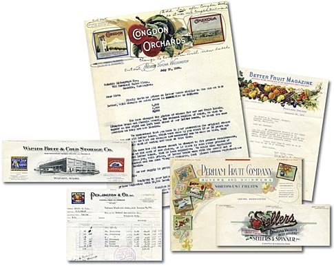
Traung, Schmidt, and most of the lithographic companies that supplied the demand for fruit crate labels also printed the company letterheads. In other businesses, the company stationery was generally produced in black and white, and a local printing firm could easily do the job. However, in the first quarter of the twentieth century, high-quality color stationery required a firm with color expertise and equipment—firms such as fruit crate label printers. An example of such a color letterhead from the 1920s is that used by Sellers & Spinner, Inc. It was printed by Traung Label Company in Seattle and is a beautiful example of a 1920s stone lithograph. Notice the great advertising slogan: “If The Northwest Grows It, We Sell It.”
The Pennington letterhead (and company label) is shown on an invoice for a shipment of 100 boxes of apples to Buford Mercantile in Virginia City, Montana. Notice the brands sold and the prices per box.
Although the printer is not identified, the Perham Fruit Company letterhead is an outstanding example of apple label artwork. All five of what are known as the “old” Perham company labels are shown. A complete set of these five labels could easily sell today for over $2,000. The Wapato Fruit & Cold Storage Company letterhead beautifully depicts the company’s packing and cold storage plant, which is still standing in Wapato. It has been many years since it was used as a packing and cold storage plant, but it is still in use as a general storage facility. The letterhead, printed by the N.P. Banknote Company of Tacoma, also features the Uncle Sam and Deep Blue Sea labels.
The Better Fruit Magazine had a cornucopia of fruit on its letterhead, and in 1935 you couldn’t beat the price of a subscription—$2.00 for three years. A nearly complete bound set of this periodical is in the collection of the University of Washington Library, and issues are a wealth of information about not only labels, but also industry trends and concerns throughout the years the fruit industry was becoming established in the Pacific Northwest.
The Congdon Orchards letterhead tells an interesting story, partially because it is dated in 1934, one of the worst years of the Great Depression in America. This particular piece of letterhead was used to write a letter to the Schmidt Lithographic Company, which printed the majority of Congdon’s labels, requesting quotations for new letterhead.
In 1934, this was an old piece of letterhead since the printed address includes the words North Yakima, Washington. North Yakima became just Yakima officially in 1917—seventeen years prior to the date of the letter. During that period, the company had also changed farm managers, become incorporated, and had apparently even had new labels printed with updated information, though the letterhead had not been updated at the same time.
Note that the Chekola label on the letterhead includes the words North Yakima. Obviously, a North Yakima Chekola apple label was used, but, to date, no copy has surfaced. The pear version has survived, but no such apple label; a mint copy of a North Yakima Chekola apple label, thus, would be quite valuable.
The fruit box label is the more common form of label art, and much research and time has been devoted to its study by museums and private collectors. Yet, sometimes, the letterhead is equally attractive, precious, and has its own story to tell.
Leave A Comment